

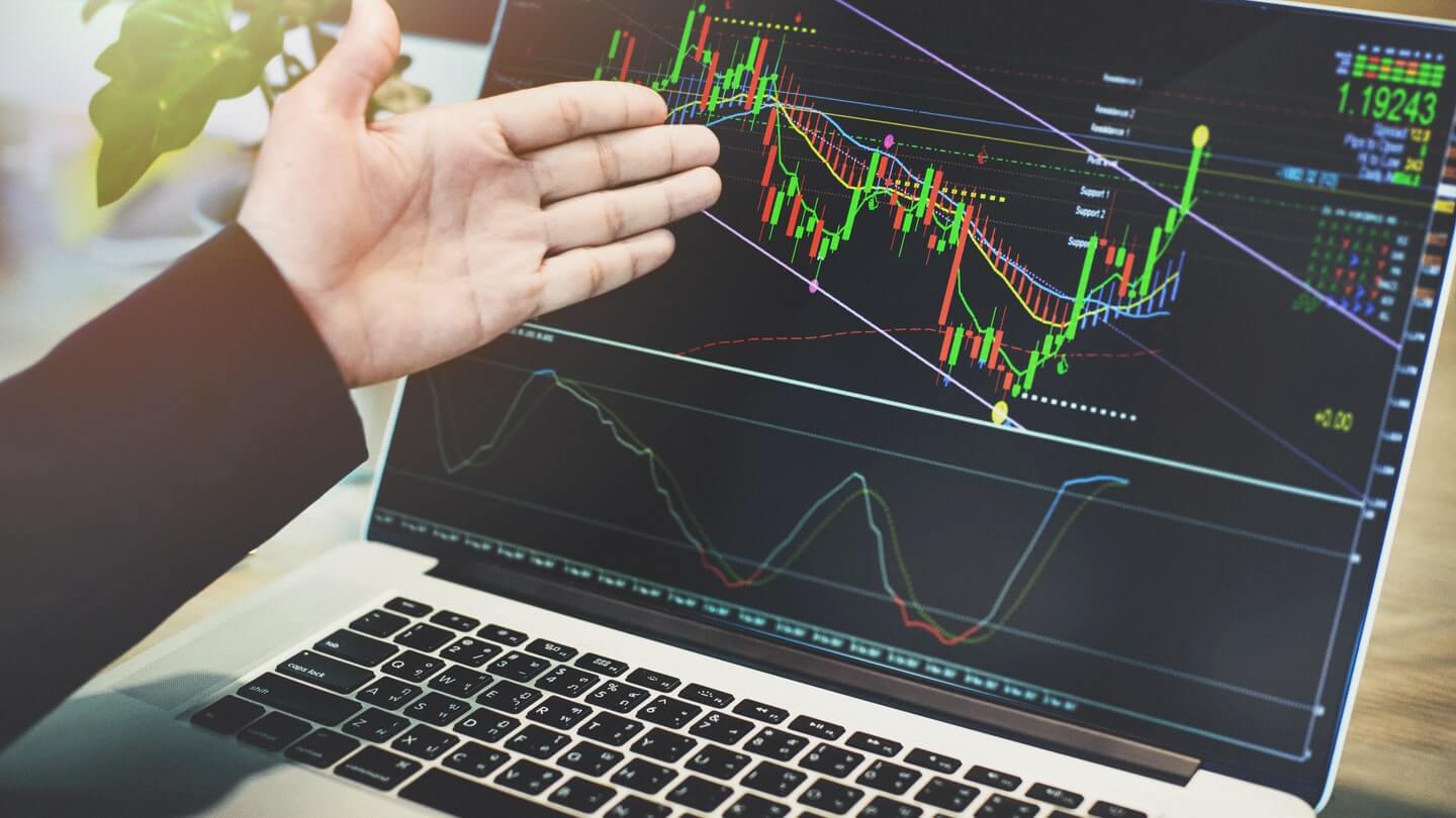
In the fast-moving world of forex, where currencies are bought and sold around the clock, charts serve as the vital link between raw price data and informed decision-making. Every price movement reflects the collective actions, expectations, and emotions of market participants across the globe. Charts bring order to this constant flow of information, allowing traders to identify structure, direction, and potential opportunity. For anyone looking to understand currency markets more deeply, learning how traders use charts is not optional. It is foundational.
This article explores how forex charts are used to analyse the market, why they matter, and how traders turn visual price data into practical insight.
Why Charts Matter in the Forex Market
Forex charts visually display the exchange rate between two currencies over a selected period. Instead of staring at streams of numbers, traders rely on charts to observe how the price behaves over time. This visual format makes it easier to identify trends, turning points, and key price levels that may influence future movement.
Because the forex market operates continuously across major financial centres, price is constantly reacting to economic data, interest rate expectations, political developments, and shifts in global sentiment. Charts help traders filter out noise and focus on what matters most: how the price has responded in similar situations before and where buying or selling pressure may appear again.
Understanding how price moves historically does not guarantee future outcomes, but it helps traders assess probabilities rather than trade on guesswork or emotion.
Common Types of Forex Charts
Line charts are the simplest form. They connect closing prices over a chosen timeframe, creating a smooth line that shows the overall direction. Line charts are useful for identifying long-term trends but offer limited detail about price fluctuations within each period.
Bar charts provide more information by showing the opening price, highest price, lowest price, and closing price for each time interval. This structure helps traders see volatility and price range, making bar charts a step up in analytical depth.
Candlestick charts are the most popular among forex traders. Like bar charts, they show open, high, low, and close prices, but in a visually intuitive format. The body and wick structure of candlesticks makes it easier to spot shifts in momentum and market sentiment at a glance. This clarity is why candlestick charts are often the preferred choice for both short-term and long-term analysis.
Reading Trends and Market Direction
One of the primary ways traders use charts is to identify trends. A trend reflects the general direction in which the price is moving over time. When price forms higher highs and higher lows, it signals an uptrend. When it forms lower highs and lower lows, it indicates a downtrend. When price moves sideways without a clear direction, the market is considered range-bound.
Identifying trends helps traders align their decisions with broader market momentum. Trading in the direction of the prevailing trend is often considered less risky than attempting to predict reversals, especially for newer traders.
Trendlines are commonly drawn on charts to visualise this direction. By connecting key highs or lows, traders can see where the price has historically respected a particular path. A break of a well-established trendline may suggest a change in market behaviour, prompting traders to reassess their positions.
Using Patterns to Anticipate Price Movement
Beyond trends, traders look for recognisable chart patterns that reflect recurring market behaviour. These patterns emerge as a result of collective trader psychology and can provide clues about potential continuation or reversal of price movement.
Common continuation patterns include triangles, flags, and wedges. These formations often indicate periods of consolidation before price resumes its previous direction. Reversal patterns, such as double tops, double bottoms, or head and shoulders formations, can signal that a trend is losing strength and may be nearing a turning point.
Candlestick patterns also play a key role in chart analysis. Individual or grouped candlesticks can reveal shifts in momentum, indecision, or strong rejection of certain price levels. While no single pattern is foolproof, patterns gain significance when they appear near important support or resistance zones. Learning how to read forex charts effectively involves understanding not just what these patterns look like, but why they form and what they represent about market sentiment.
Conclusion
Forex charts are far more than visual representations of price. They are decision-making tools that reveal trends, patterns, and key levels shaped by global market behaviour. By learning how traders use charts to analyse the forex market, you gain a structured way to interpret price action and assess opportunities with greater clarity.
Mastering chart analysis takes patience and ongoing learning, but the reward is confidence. When you understand how to read forex charts and apply that knowledge consistently, you are better equipped to navigate the complexity of the forex market with insight, discipline, and purpose.
